Posts

Yor blue is not happy

Image
     What are the most surprising comments did you get from clients?      Once I get a task to make logo in blue color. I was given one of google services to follow its blue colour and I just used colorpicker on screen itself to get it. So the comment I've got on submitted work was - "that blue is not happy".     Not sure how often nowadays graphic designer facing with display issues, but at the start of career in digital grafics you probably met similar issue. If you have no opportunity to check the color or font with developer tools in your browser you would better ask to provide color code and even check if it on safe colors list to avout unexpected results.

Going through neurographics

Image
    Art teachers, expecially those who works with children knows that it is more fruitful to be prepared with some templates or methods that grarantee good result thats why neurographics attract my attension. Method based on free hand drawing and coloring so the result is very individaul and still effective.     If we believe that art it is not only about right shapes and proportions but also about feeling and emotions looks that methodology is a good appoach.     From my perspective that technique often brings a result of feel and look like vitrage that is my passion.     

Work with referencies

Image
  One of good practicies is colleting and use referencies for sketching or painting. Suppose now it can be named a moodboard. That is an interesting fact that people intuitively start collecting most attractive illustrations from magazines and newspapers.  Once upon my fineart school time one of my classmates bring hers aunt art referecies book so almost whole group become collect illustration referencies in the same way by gluing cutted out illustrations to old notebook. Later my husband told that he gained his profissioncy thanks to redrawing images from his aunt collection. So my strong suggestion is to start your own collection shortly.

Moon is a harsh mistress

Image
When moon is full... One of the most exiting novels I recently read is "Moon is a harsh mistress" by Robert Heinlein, so when the moon was full last month I can't not draw something on this topic. I made it in vector and you can get it for free from behance page dedicated to it https://www.behance.net/gallery/253565479/Evening-mood Let me know if you like that kind of grphics, I hope share my next work when get new inspirations

Low fidelity prototype importance

Image
Few years ago I ejoyed coursera UX course from google team. First modules was about accessability, biases people have, self positioning, setting goals.  Roles in application design was well explained - so attendees has clear definition on texting, motion, graphics designers. But most insightful was definition about low- and high-fidelity prototypes. That let me think a lot. As at work at that time I has multiple corrections after component release, I suppose that was coused beacause we miss something while skippnig step of low fidelity prototype creation.  

Network ethics

Image
Most of us faced with necessity to post some content to social network, we even have bunch of courses how to present yourself on network and make clickbait leads. I'am afaid that the results of it are extralong pictures that has few words with selfie on the botton more then screen height to push reader tap on it beacuse it is almost impossible to scroll over it. How do you think do such design shows respect to their subscribers?

'Render', 'Rendering', 'Slot' in Blender

Image
  So, what are 'Render', 'Rendering' tabs for and how 'slots' appear. In 'Rendering' tab we can choose 'Render Engine'  its parameters and set some 'Viewport' options and choose 'Slot' for next rendering output. From 'Render' we can launch rendering process itself so it will use setting configured in 'rendering tab' and that configs willl go to appropriate slot, that way you can keep mutiple configurations 'for render'. So in flow 'Render' goes after 'Rendering' even it goes before on panel.   

Light setup in Blender.

Image
  To see how added 'light' elements affect on scene objects 'Rendered' mode should be set.  There are 4 types of light elements: 'point', 'sun', 'spot', and 'area'. Actually I don't get expected shadows from 'sun' element. 'Point', 'spot', and 'area' require to strenthen 'power' parameter in 'data' tab of an 'obeject properties panel'. The most interesting is a theory about 'Rim' (for backround), 'Fill' and 'Key' lights suggest by 'Blender fundamentals 2.8:23' list on an Blender channel on youtube.

NY resolutions: Blender render marathon

Image
  Sometimes 40 days long marathon to keep some activity motivates more than ambitions to achieve something in undefined future. I'm about 4 days playing with Blender. Still not understand why 'shading' tab generates much more attractive picture with 'controls' as on image above than produces 'Render > Image' as shown belove. So I made list of 40 topics I want to cover in next 40 days and let see what will happen. Make water, sand, and grass texture objects and render them as photorealistic picture. Find out why shadows from sun are on oppsite side than expected : Check if I can make sectios in Blender, and materials can intersect each other if need. what are difference between 'Transform' and 'Delata transform' extrudes of different curves how to create solids of revolution can i make .svg outline from 'viewport' or  can i put measurements can we create a complex texture with just blender tools with no external image uploading crea...

Visualization vs graphics

Image
  I was little bit angry with my collegues from graphic design department as they are focused to create something 'sexy' without keep perspective, shadows and shadows.  Mayby I was just envious because most of commercial graphic designers are employed just after few month courses and not imagine basics how many calculations requirres drawing in perspective. Offcourse I more appreciate graphics with right drawn structure but hope to keep empathy for commercial drawers. 

Contingency in art. Side effects

Image
  Sometimes mistakes or side effect can be source of new ideas. This time I've played with selections in corel draw and caught thrilling effect on facade. Scaled nodes even remain me chat ballons. That can be idea of a poster "May be silent crowd of people with clouds of thoughts" :). Sometime hidden elements are key ones.

Basic art materials to start

Image
How many materials an artist needs? People have a preference for specific colors. Even if you buy a set of hundreds of colors after a month of regular use you will notice 5-6 colors are finished. So why not buy those most used ones only. Another truth about colors is just getting more on mixing basic ones. During fine art lessons many tasks on mixing colors are usually given. Students have to generate over 20 colors out of 3-4 basic ones. Talking about other tools you can actually use many things around as art materials. You can paint even without a brush. The image above is drawn with ink and stick. You can use old plastic credit or discount card instead of pallete knive. Posters can be made of masking type and sponge. You can see other example in my post on workshop made with paper, scissors, 2 acrylic paints colors, thred and sponge: https://lentochko.blogspot.com/2017/03/masterclass-in-poznan.html Minimal art materials set. So, summariznig all it up I recomend: whatman whatman,...

Reusable assets

Image
 If I ever get an interview with an illustrator one of my question to him or her will sound "Are you using prepared assets and backgrounds for better performance". Some repeatable element in illustations also make sense because of better recognizability and help to keep a plot by put known actors to next episodes.  And the next questions would probably be about assets management process. You know there actually are standart sets of people mocks, greenery used for architecture visualisations, collages, floor plan drawing itself.  Here is example I've used many times in my works. Different people drawn in similar type sitting around the table. I can mix them wherever I whant in my later works. It can be changed to show people making project estimation by story points: Another case you can use same people presented in a way of "colleagues sitting at business meeting":  Stand for minute and think what assets sets can you build to perfrom better in your future projec...

7 impediments to overcome becoming an artist

Image
After long painfull thoughts to put some conclusions to text I finally giving hints for starting artists:  1. Put everything in context It difficult to find a person who can't draw some things in a really attractive way. From my observations even many drawing masterclasses promote welldrawn standalone things as final result. But if you look precisely at real designers and artists artworks you will notice that most of them become so loved because they cooperate with context brilliantly.  2. Feal comfortable drawing on big paper sizes Back to previous point nobody can percept well small faded drawing hanging on the wall. The distance people see paintings on walls or books on the shelves is too long and it makes tension to catch a message of a subtly drawn picture on a papersheet from notepad. Same for other side - it takes more tension for artist to transform to miniature real size object as well. Looks like doing double more work for double less result. 3. Do not hesitate to dr...

Learn to drawing roadmap: intro

Image
Here is introduced a serie of articles that are actually a studying plan that consists of 15-17 tasks - appoximate number of weeks semesters: Part 1: Setup Part 2: Basic shapes linear drawing Part 3: Shapes and shades drawing Part 4: Textures study Part 5: Reflections study Part 6: Drapery drawing study Part 7: Drawing complex shapes  Part 8: Plein air Part 9: Multiple plans study Part 10: Skin painting Part 11: Portrait in collage technique Part 12: Reproduction Part 13: Composition from set Part 14: Same idea in defferent techniques Part 15: Realistic to abstract Part 16: By choice Part 17: Final assesment

Drawing roadmap. Part 1: Setup

Image
Setting up the goal.      It can sound like reverse engineering :). Let's define what are the final objectives of getting a new skill or sharping one you already have. References of works that made you motivated to start you learning roadmap should be taken into accout as much as possible. So, here is the start point: take a reference picture and simply duplicate it. If you afraid that it can take enormouse amount of time just set a limit to 45 min or 1,5 hours and then you can compare yor artwork with reference, define what things didn't go well and make a check list. Setting up the goal.      Set time to be commited per week. (on some marathons frequence can be set even per day). Try to think what pretext can be appear at planned time to give up drawing session and specify prevention procedures for that. Keep materials in accessible place.      Make materials to be prepared and keep them in accessible place while it become a habit. If you w...

Drawing roadmap. Part 2: Basic shapes in perspective

Image
  The very basic skill before drawing thing of a complex shapes is ability to display object of a basic shape in perspective properly. Intial practical task for studens in academic drawing are usually liniar drawing of simple geometric shapes made of gispsun of a similar size (normally it 15x20cm, 20x20cm) for better perception. Even invisible edges must be drawn to execute that task. Check next steps: Part 3: Shapes and shades drawing Part 4: Textures study Part 5: Reflections study Part 6: Drapery drawing study Part 7: Drawing complex shapes  Part 8: Plein air Part 9: Multiple plans study Part 10: Skin painting Part 11: Portrait in collage technique Part 12: Reproduction Part 13: Composition from set Part 14: Same idea in defferent techniques Part 15: Realistic to abstract Part 16: By choice Part 17: Final assesment

Drawing roadmap. Part 3: Shades&shadows drawing

Image
  Once you start analyse shadows more priticely you can notice what part of they can look really illogically. In drawing there even considered a lot of types of them. But all that classification is about to difine some rules not to get lost how to draw them correctly.  Than you can procced with next steps: Part 4: Textures study Part 5: Reflections study Part 6: Drapery drawing study Part 7: Drawing complex shapes  Part 8: Plein air Part 9: Multiple plans study Part 10: Skin painting Part 11: Portrait in collage technique Part 12: Reproduction Part 13: Composition from set Part 14: Same idea in defferent techniques Part 15: Realistic to abstract Part 16: By choice Part 17: Final assesment  If that task causes difficulties you can check previous step: Part 2: Basic shapes linear drawing

Drawing roadmap. Part 4: Textures study

Image
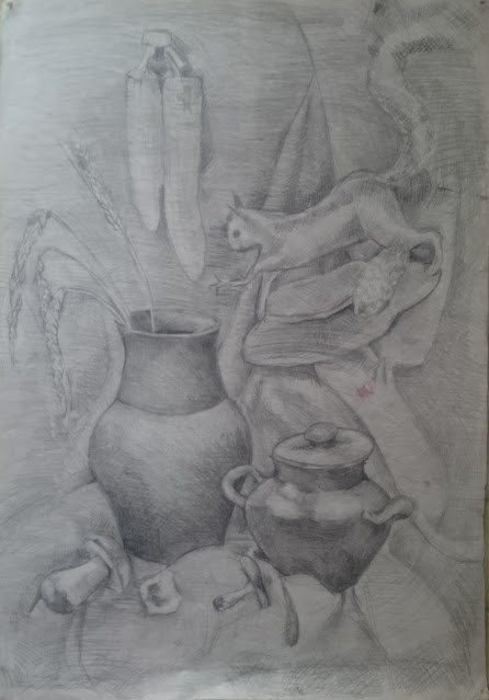
  All drawings consist of lines and points, even painting constist of spots as well as digital works consist of pixels and that are basic elements of any pictures can express really a lot.  Take a look at Gustav Klimt landscape painting that are dots and spots combined to a beautiful realistic images. Take few things of a different roughness/glossiness for your next art-work, focus on conveyng shapes and textures with strokes directions, length and dencity. You can find next parts here: Part 5: Reflections study Part 6: Drapery drawing study Part 7: Drawing complex shapes  Part 8: Plein air Part 9: Multiple plans study Part 10: Skin painting Part 11: Portrait in collage technique Part 12: Reproduction Part 13: Composition from set Part 14: Same idea in defferent techniques Part 15: Realistic to abstract Part 16: By choice Part 17: Final assesment Check previuos tasks: Part 3: Shapes and shades drawing Part 2: Basic shapes linear drawing  

Drawing roadmap. Part 5: Reflections study.

Image
I think the tip:"to draw everything around" not sounds reasonable for all cases. Following path starting from more simple things to more complex and diversive ones it more consiquent and less stressful.  Once you are ok opaque objects and textures in drawing, let continue with adding high polished and glass objects to your compositions. Check next steps here: Part 6: Drapery drawing study Part 7: Drawing complex shapes  Part 8: Plein air Part 9: Multiple plans study Part 10: Skin painting Part 11: Portrait in collage technique Part 12: Reproduction Part 13: Composition from set Part 14: Same idea in defferent techniques Part 15: Realistic to abstract Part 16: By choice Part 17: Final assesment